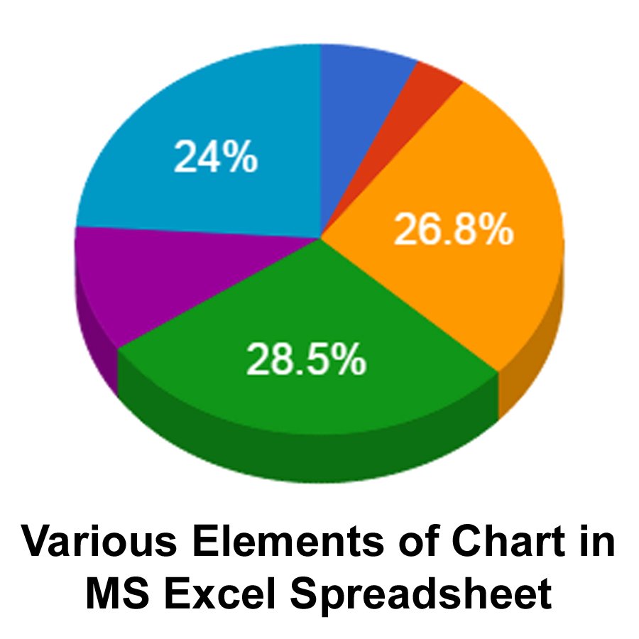
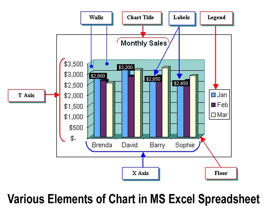
The graphical representation of numerical data is known as Chart or Graph. It makes easy to compare and to understand the numerical data. A Chart is created with a range of data stored into the worksheet cells. Charts are used to display numerical data in a graphical form. In a spreadsheet, a chart consists of various elements. Its components are shown below:
Following is a brief description of various elements of a chart:
Chart Area
It is the total area that contains all the elements of the chart. No chart element can be outside this area.
Plot Area
It is the area that actually represents the data in graphical form. It contains elements such as graph lines, bars, pie, scatter, etc.
Series
A collection of similar data points that are displayed in the chart are called series or data series. A chart can display one or more data series. A series can have one or more data points. It can have a maximum of 4000 data points.
X-axis
The horizontal axis is called the X-axis. It usually displays the categories.
Y-axis
The vertical axis is called the Y-axis. It usually represents a scale against which data points are displayed in the chart. The spreadsheet automatically adjusts the scale to make sure that all data points are visible.
Legend
The box that contains symbols showing the name and color of each series in the chart is called legend. It is usually used when the chart consists of two or more series.
Chart Toolbar
The Chart Toolbar is displayed when a chart is selected. It is used to select any object in the chart, change the chart type or edit the chart.
The chart toolbar is displayed when the chart is selected. If it is not displayed as the chart is clicked then right-click on any button in a toolbar and select Chart toolbar from the shortcut menu. The toolbar disappears when the chart is deselected.

